Podcast Cover Art Research and Development
This research was done by my team member Kanna
RESEARCH
A podcast cover art is essential for every podcast. Podcast cover necessary to attract listeners' attention as it is the first thing your listeners will see prior to listening to the podcast. It's a visual representation for your podcast and it conveys the big idea of the podcast.
After doing my research and analysis, I notice that simplicity is the key to designing a good podcast cover. It must be clear and straightforward in order for the audiences to understand.
Here are a few true crime podcast cover arts I took a look at :
Most of them use black or light grey as the base color. Red is often used as it connotes blood and death. Most of it uses dark backgrounds and white or a vivid color text for contrast. Some of them feature elements related to crimes such as syringe and fingerprint to clearly indicate that it's a true crime podcast. Many of them feature the logo of their production house so audiences know which organization produced the podcast. The fonts used are mostly serif or sans serif fonts. Serif fonts give off traditional and classical feel while sans serif makes the cover feel modern and simple. Both types of fonts are often used for formal and professional purposes.
I also looked at murder mystery film posters as references. I noticed how a lot of them has the color scheme of red and blue. Blue connote cold and negative feelings and red connotes anger and blood. The contrast of these two colors help attract viewers.
Here's a few thumbnails for true unsolved crime videos from Buzzfeed Unsolved. It features a picture / illustration of the victim as the central image. Every thumbnails also features the Buzzfeed unsolved logo and a similar composition so audiences can distinguish the video quickly. The dark color scheme and the 'true crime' text makes it clear that it's a true crime content.
SKETCHES
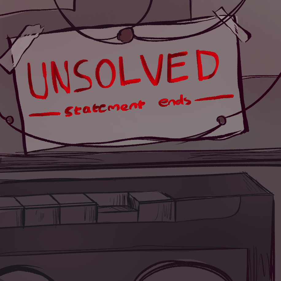
Here are sketches and a cover art made my by my teammate, Erina.
"I made it look like it's a photo taken from Vienna's desk. With the recording machine and the police board with the strings. A common visual for a person piecing a mystery together. I made everything monotone to give focus to the title. "
DEVELOPMENT
For the background I combined 3 pictures of black roses (which connotes death), The Black Dahlia and illustration of Jack the Ripper together. I then blend the collage with a dark reddish color and added noise to create an old school feel. However I later changed the background into a dark blue color to create a contrast between the background and the logo.
For the name of the production house I tested several fonts and after several discussions with my teammates we agreed that the font LEMON MILK (the first picture) looks the best because of its simplicity.
After creating the background and deciding on fonts the cover looked too plain and unappealing so I added an image of blood splatter and red strings (as a referent from police suspect boards).
This is our final podcast cover art:


.jpeg)
.jpeg)
.jpeg)


Comments
Post a Comment